Fylgja Carousel
A carousel is a horizontal, scroll-snapping strip of slides. The base version is pure CSS: a few Fylgja utilities turn a row of items into a snapping slider that works with touch, trackpad, and scrollbar, no JavaScript.
Preview
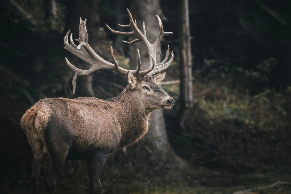


<div class="grid-cols grid-flow snap scroll-x scroll-mask gap" style="--grid-cols: 1.15; --snap-align: center">
	<img class="rounded w-full object-cover" style="--size-y: 240px" src="/images/placeholders/deer-wide.webp" alt="A deer in a misty forest" width="740" height="240" />
	<img class="rounded w-full object-cover" style="--size-y: 240px" src="/images/placeholders/fox.webp" alt="An orange fox in the grass" width="500" height="300" />
	<img class="rounded w-full object-cover" style="--size-y: 240px" src="/images/placeholders/cat.webp" alt="A cat lounging in the sun" width="500" height="300" />
</div>
Usage
grid-cols grid-flowlays the slides out in equal columns flowing horizontally;--grid-colssets how many are visible (1.15peeks the next one).snapadds scroll-snap so each slide clicks into place,scroll-xmakes the strip scrollable, andgapspaces the slides.- Size each slide’s media as you like (here
w-full object-coverwith a fixed--size-yheight and aroundedcorner).
Enhanced with Snap Slider
For keyboard navigation and prev/next buttons, upgrade the same markup with the Snap Slider. Install and register it (as a custom element or an Alpine plugin) from the Snap Slider docs, which also cover the pager and other options. The CSS slider still works if the JS never loads, and it ships as a custom element (recommended) and as an Alpine.js component, so use whichever fits your stack.
Put the data-prev / data-next buttons before the track. The custom element
needs role="region" and an aria-label to name the region; the Alpine version
uses a <section> with an aria-label, which is a region landmark on its own.
<snap-slider role="region" aria-label="Featured photos">
	<div class="flex gap-sm" style="--my: 0 var(--size-3)">
		<button type="button" data-prev aria-label="Previous slide">
			<svg xmlns="http://www.w3.org/2000/svg" width="24" height="24" viewBox="0 0 24 24" fill="none" stroke="currentColor" stroke-width="2" stroke-linecap="round" stroke-linejoin="round" aria-hidden="true"><path d="m15 18-6-6 6-6"/></svg>
		</button>
		<button type="button" data-next aria-label="Next slide">
			<svg xmlns="http://www.w3.org/2000/svg" width="24" height="24" viewBox="0 0 24 24" fill="none" stroke="currentColor" stroke-width="2" stroke-linecap="round" stroke-linejoin="round" aria-hidden="true"><path d="m9 18 6-6-6-6"/></svg>
		</button>
	</div>
	<div data-track class="grid-cols grid-flow snap scroll-x gap" style="--grid-cols: 1.15">
		<img class="rounded w-full object-cover" style="--size-y: 240px" src="/images/placeholders/deer-wide.webp" alt="A deer in a misty forest" width="740" height="240" />
		<img class="rounded w-full object-cover" style="--size-y: 240px" src="/images/placeholders/fox.webp" alt="An orange fox in the grass" width="500" height="300" />
		<img class="rounded w-full object-cover" style="--size-y: 240px" src="/images/placeholders/cat.webp" alt="A cat lounging in the sun" width="500" height="300" />
	</div>
</snap-slider><section x-data x-snap-slider aria-label="Featured photos">
<div class="flex gap-sm" style="--my: 0 var(--size-3)">
<button type="button" data-prev aria-label="Previous slide">
<svg xmlns="http://www.w3.org/2000/svg" width="24" height="24" viewBox="0 0 24 24" fill="none" stroke="currentColor" stroke-width="2" stroke-linecap="round" stroke-linejoin="round" aria-hidden="true"><path d="m15 18-6-6 6-6"/></svg>
</button>
<button type="button" data-next aria-label="Next slide">
<svg xmlns="http://www.w3.org/2000/svg" width="24" height="24" viewBox="0 0 24 24" fill="none" stroke="currentColor" stroke-width="2" stroke-linecap="round" stroke-linejoin="round" aria-hidden="true"><path d="m9 18 6-6-6-6"/></svg>
</button>
</div>
<div data-track class="grid-cols grid-flow snap scroll-x gap" style="--grid-cols: 1.15">
<img class="rounded w-full object-cover" style="--size-y: 240px" src="/images/placeholders/deer-wide.webp" alt="A deer in a misty forest" width="740" height="240" />
<img class="rounded w-full object-cover" style="--size-y: 240px" src="/images/placeholders/fox.webp" alt="An orange fox in the grass" width="500" height="300" />
<img class="rounded w-full object-cover" style="--size-y: 240px" src="/images/placeholders/cat.webp" alt="A cat lounging in the sun" width="500" height="300" />
</div>
</section>Accessibility
- The strip is scrollable by keyboard; the Snap Slider adds arrow-key navigation between slides.
- Name the slider region with an
aria-label(or a heading referenced byaria-labelledby) so it is announced as a distinct region. - Give each slide’s image a descriptive
alt. - If the carousel auto-advances, provide a pause control and do not trap essential content behind the auto-play.
FAQ
Does the carousel need JavaScript?
No. The scroll-snap slider is pure CSS via Fylgja utilities. The Snap Slider package is optional and only adds a pager, keyboard navigation, and prev/next buttons on top.
How do I change how many slides are visible?
Set --grid-cols. Use 1 for one slide at a time, a value like 1.15 to peek the next slide, or 2 and up to show several at once.
How do I install and set up the Snap Slider?
The Snap Slider ships only JavaScript, so install the package and register the custom element or Alpine plugin. The example markup here leaves that out on purpose; the install and setup steps live in the Snap Slider docs.