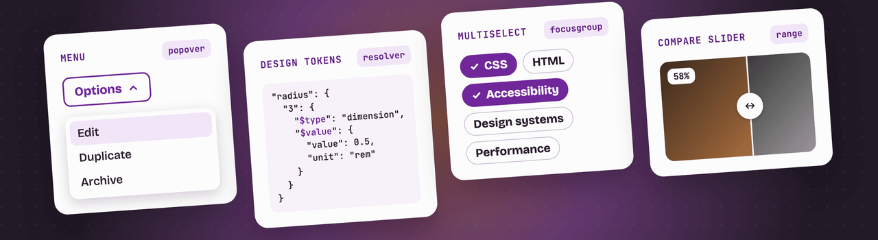
Fylgja CSS 2.3 is here, bringing updates to @fylgja/base 2.2, @fylgja/tokens 2.3, and @fylgja/utilities 2.2 under a single guiding theme: getting more out of the modern web platform. Popovers now look and behave right out of the box with native anchor positioning, design tokens adopt the first stable community specification, and Fylgja UI expands from 31 to 55 ready-to-use components.
Update with:
npm install fylgja@latestHere’s a closer look at what’s new.
Popovers that are ready to use in @fylgja/base
Non-dialog popovers, such as menus, dropdowns, and tooltips, now get the same elevated surface styling
as dialogs out of the box: background, text color, corner radius, and elevation shadow, paired with
tighter padding and none of the awkward browser-default borders. Every layer is exposed as a CSS
custom property (--popover-bg, --popover-color, --popover-radius, --popover-padding, and
--popover-shadow), making it easy to restyle any overlay without touching a selector.
In browsers supporting CSS anchor positioning, auto and hint popovers automatically anchor to the
button that opened them. You can place them anywhere around the trigger using --popover-position
(which accepts any valid position-area value) and fine-tune spacing with --popover-offset. Meanwhile,
manual popovers retain their centered default. The new Menu and
Tooltip components in Fylgja UI are built directly on these primitives.
Base also picked up a few smaller refinements:
- Search clear button: The native clear button in search inputs now scales with font size and inherits
the text color. Customize it via
--search-clear-size,--search-clear-gap,--search-clear-color, and--search-clear-icon. - Fieldset error highlighting: In the optional theme
(
@fylgja/base/theme.css), thelegendof anyfieldsetcontaining an invalid field now colors with--form-error-color, so the entire field group reads as invalid at a glance. - Print styles for disclosures: Print stylesheets now expand closed
<details>elements, ensuring accordion and disclosure content isn’t lost on paper. - Emoji fallbacks: A dedicated
--family-emojicustom property isolates emoji fallbacks, so you can swap or reuse them independently. - Menu list reset: The list reset for
[role="list"]and lists inside<nav>now covers<menu>elements as well.
A better system font stack
The system font stack in @fylgja/base no longer relies on system-ui. While convenient, system-ui
resolves inconsistently across operating systems, notably on Windows, where it often falls back to fonts
like Yu Gothic UI that mangle Greek letters and Chinese punctuation.
The refreshed stack now leads with -apple-system and BlinkMacSystemFont to preserve native typography
on Apple devices, while allowing other operating systems to pick fonts that naturally match the user’s
locale. The monospace stack also picked up SF Mono, Monaco, Cascadia Mono, and Liberation Mono as
reliable fallbacks.
Design Tokens 2025.10 in @fylgja/tokens
Tokens now ship in the Design Tokens 2025.10 format, the first stable release of the
Design Tokens Community Group specification. The new
tokens/fylgja.resolver.json is a compliant Resolver document, allowing any modern design tool or
pipeline to consume Fylgja’s aspect ratios, borders, radii, colors, easings, font sizes, shadows,
spacing, and z-index layers directly, without proprietary plugins or custom intermediaries.
import tokens from "@fylgja/tokens/tokens/fylgja.resolver.json" with { type: "json" };Values are strongly typed, and composite tokens like shadows keep their structured properties rather
than being flattened into plain strings. (Note that sizes utilizing calc(), clamp(), or ch units are
omitted from this JSON export, as the specification cannot express them yet; they remain available across
our CSS and SCSS packages as usual.)
This release also resolves a scoping issue in the full CSS bundle (@fylgja/tokens/css/index.css).
Colors and shadows were previously declared on :root, preventing local overrides like --hue,
--chroma, or --shadow-color on an element from taking effect. They are now scoped per element,
matching the behavior of individual files like colors.css. Dark mode shadows from shadows.dark.css
are now properly applied in the bundle as well.
Toggles for popover invokers in @fylgja/utilities
Our toggle utilities (toggle-rotate, toggle-flip, toggle-turn, toggle-hide, and toggle-show)
have always responded to aria-expanded. However, native popovers opened via commandfor or
popovertarget manage state without toggling ARIA attributes.
These utilities now also track the state of a popover that immediately follows its invoker button. This means UI accents like a rotating chevron in a dropdown button work purely in CSS, with zero JavaScript required.
We’ve also shipped two key bug fixes:
- Restored
scroll-maskin minified builds: Lightning CSS foldsanimation-timelineinto theanimationshorthand when minifying. No browser accepts that syntax, so the fade mask never ran. While this remains an open issue in Lightning CSS, Fylgja now keepsanimation-timelinein a separate CSS rule so the minified files Fylgja ships work out of the box, and your own build stays safe when it minifies with Lightning CSS, as Vite and Astro do. - Screen reader text wrapping: Text styled with
.sr-onlyis now prevented from wrapping inside its 1px box, resolving an issue where certain screen readers would announce adjacent words without spaces.
Fylgja UI grows to 55 components
When we introduced Fylgja UI, we noted the obvious gaps: tabs, tooltips, popovers, steppers, and more. Over the past few months, 24 new components have joined the collection, closing nearly all of those gaps. Like the rest of the library, each component is built on clean, semantic HTML with native platform behaviors, completely free, and ready to copy and paste:
- Navigation: Tabs, a Stepper, a responsive Navbar, and an Action List.
- Overlays: A Menu and Tooltip, both powered by the
new popover defaults in Base, including
hintpopovers andinterestforfor tooltips. - Actions: A floating Speed Dial and a
Button Corner Shape showcasing the emerging CSS
corner-shapeproperty. - Feedback: An Alert, a shimmer Skeleton loader, a Callout, and a collapsible Callout Collapse.
- Forms: A Form Field with native form validation styling, and a
keyboard-accessible Multiselect built on checkboxes and
focusgroup(available as a list or chips). - Sliders: A CSS-only Compare Slider to reveal image comparisons, driven entirely by a native range input.
- Layout: A responsive Bento Grid alongside three footer layouts: Inline, Classic, and Brand.
- Data display: A responsive Gallery and a structured Timeline.
- Typography: A brand-new category featuring Heading Group, Heading Underline, and Heading HR.
Missing a component you’d love to see? Open an issue on the site repository.
Published with provenance
Every package is now published through GitHub Actions with npm provenance, giving you verifiable proof that what you install was built directly from our public repository source.
Before you upgrade
There are two small changes to keep in mind, both related to the font stack in @fylgja/base:
system-uiremoval: If your project specifically relies onsystem-ui, you can restore it in your own stylesheet with--family-system: system-ui;.$font-familySass variable removed: The legacy$font-familySass variable has been removed. It was never wired up to--family-systemunder the hood, so setting the--family-systemcustom property directly is the recommended way to configure your fonts.
For the full breakdown of changes, check out the changelogs for @fylgja/base, @fylgja/tokens, and @fylgja/utilities.
As always, if something does not work the way you expect, feel free to open an issue on GitHub. We look forward to seeing what you build with 2.3!
Happy coding!