Fylgja Components Overview
Browser all of what Fylgja has to offer in CSS components and add-ons
Featured
Our recommended components
Form
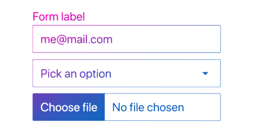
The form component is super easy to use, it's a zero config module that styles all form elements directly. Allowing you to focus on the form itself.
Auto Grid
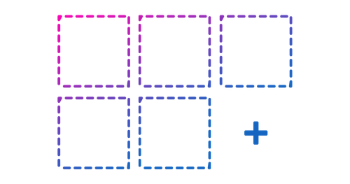
A super small grid with auto flowing behavior, based on the container size. Using a similar method to container queries.

Dialog
The dialog combines 3 components in 1, it a modal by default, and with a small change it's a offcanvas, notification popup aka the snackbar.

Tokens
A collection of all Fylgja tokens offered for specific design tools or frameworks.

Utilpack
Build and use your own CSS utility classes with Sass using the Fylgja utilpack.

Alpine Dialog
Bring the power of AlpineJs to the HTML dialog.
Native Elements
Fylgja Components that require no additional CSS classes to work
Base
Common defaults to make your body and typography look good and easy to change to your needs.

Control
The control component styles the default `input[radio]` and `input[checkbox]`, allowing an easier control on the style of both these elements.
Form
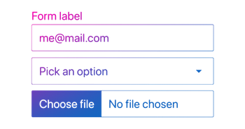
The form component is super easy to use, it's a zero config module that styles all form elements directly. Allowing you to focus on the form itself.

Dialog
The dialog combines 3 components in 1, it a modal by default, and with a small change it's a offcanvas, notification popup aka the snackbar.

Code
The Code component is a extension component on the base component.

Details
The details component enhances the default details behavior.

Progress
The progress component is used to show progress indication in a form or somethings else.
Range
Range component will add solid foundation for a input range slider
Table
The table component is super easy to use, since it is a zero config module that styles the table directly. Allowing you to focus on the table it self.
CSS Utilities
Fylgja Utilities that make it easier to apply styles and spacing, using CSS classes directly in your HTML

Utilpack
Build and use your own CSS utility classes with Sass using the Fylgja utilpack.

Aria-only
The aria-only (a.k.a. sr-only) visually hides elements. But keeps it accessible to screen-readers and other aria tools.

Gradient
Add gradient's with ease via the gradient utility class.

Hashlink
The Hashlink is a small utility component, which adds smooth scrolling to the page via CSS and a scroll offset to any element with a id.

Scrollbar
Customize or hide the scrollbar with ease.

Stretched-link
Make any component fully clickable via a nested link.

Transform
Add transforms with ease, with the power of CSS variables.

Transition
Add transitions with ease, with the power of CSS variables.
CSS Props (Design Tokens)
Fylgja Props (Design Tokens) that make it easier to apply styles and spacing, using CSS variables

Tokens
A collection of all Fylgja tokens offered for specific design tools or frameworks.

Colors
Add a collection of prebuild colors to any project with ease, using Fylgja Colors.

Fonts
The Fylgja fonts offers Design Tokens (CSS props) for consistent and semantic typography.

Borders
The Fylgja borders offers Design Tokens (CSS props) for consistent and semantic borders.

Easing
The Fylgja easing offers Design Tokens (CSS props) for consistent and semantic transitions.

Mq
Helper component for adding media query specific variables to multiple components.

Shadow
The Fylgja shadow offers Design Tokens (CSS props) for consistent and semantic shadows.

Sizes
The Fylgja Sizes offers Design Tokens (CSS props) for consistent and semantic sizes, in typography, spacing and general sizes.

Z Layer
The Fylgja z-layer offers Design Tokens (CSS props) for consistent and semantic z-indexing.

Elevation
The Elevation component is a util package for shadows, where it offers shadows as CSS variables.
Layouts
Fylgja Components that make it easier to apply layout styles
Auto Grid
A super small grid with auto flowing behavior, based on the container size. Using a similar method to container queries.
Aspect Ratio
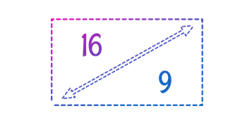
The aspect ratio component is used to set videos to a certain responsive aspect ratio, but can also be used for images and other content.

Card
The card component is a wrapper component. It allows you to make visual sectioned content, that is not part of the main flow.
Container
The container component is wrapper component, to make all child elements fit better in the page.
Input-group
The input group extends upon the `@fylgja/form`. By providing a wrapper that allows for more complex form field styles.
Marquee
The marquee component lets you make infinite CSS sliders without any JavaScript

Scroll-slider
This CSS slider component allows you to make sliders with ease, and has no requirements to any Javascript.

Section
The Section component is a wrapper component to show content in a sectioned area.
Flex Grid
Create a complete grid using flexbox, and only set the columns you need.
Navigation
Fylgja Components that make it easier to apply navigation styles
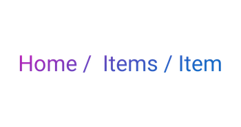
Breadcrumbs
The breadcrumbs component is a navigational aid, it allows users to maintain awareness of their location in an app or a website.
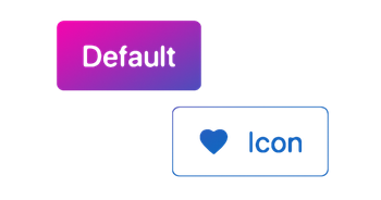
Button
The Button component serves as an interactive element. To call your users to an action.
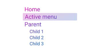
Menu
The menu component makes it easy to build common navigation patterns, like a navbar or menu in a dropdown.
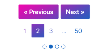
Pagination
The pagination component makes it easy to build many pagination patterns, like button only next previous nav or dots nav.

Skip Link
The aria-only (a.k.a. sr-only) visually hides elements. But keeps it accessible to screen-readers and other aria tools.
Typography
Fylgja Components that make it easier to apply typography styles

Base
Common defaults to make your body and typography look good and easy to change to your needs.

Code
The Code component is a extension component on the base component.

Details
The details component enhances the default details behavior.
List
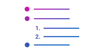
The list component adds more control on how you can style lists. By adding a custom marker option with full flexibility to style and animate.
Print component will add solid foundation for printing.

Table
The table component is super easy to use, since it is a zero config module that styles the table directly. Allowing you to focus on the table it self.

Font Face
Add fonts with ease, via the font-face mixin
Forms
Fylgja Components that make it easier to apply form styles

Control
The control component styles the default `input[radio]` and `input[checkbox]`, allowing an easier control on the style of both these elements.

Form
The form component is super easy to use, it's a zero config module that styles all form elements directly. Allowing you to focus on the form itself.

Input-group
The input group extends upon the `@fylgja/form`. By providing a wrapper that allows for more complex form field styles.

Progress
The progress component is used to show progress indication in a form or somethings else.

Range
Range component will add solid foundation for a input range slider
Elements
Fylgja components that make it easier to apply element specific styles

Avatar
The avatar component allows you to make an avatar style with ease.
Badge
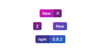
The badges component serves as a small blocks to indicate notifications, or to highlight an item.

Control
The control component styles the default `input[radio]` and `input[checkbox]`, allowing an easier control on the style of both these elements.

Dialog
The dialog combines 3 components in 1, it a modal by default, and with a small change it's a offcanvas, notification popup aka the snackbar.

Button
The Button component serves as an interactive element. To call your users to an action.

Card
The card component is a wrapper component. It allows you to make visual sectioned content, that is not part of the main flow.

Progress
The progress component is used to show progress indication in a form or somethings else.
Add-ons and Helpers
Fylgja Plugins that improve or add extra functionality to Fylgja and/or other tools

Tokens
A collection of all Fylgja tokens offered for specific design tools or frameworks.

Alpine Dialog
Bring the power of AlpineJs to the HTML dialog.

Props Builder
Build your own CSS props a.k.a Design Tokens, with ease.

Sass Extend
Adds more SCSS super power functions.

Theme
Helper component for adding theme specific SCSS variables to multiple components.

Stylelint Config
A sharable stylelint config object that enforces Fylgja's CSS rules.

Flex Grid
Create a complete grid using flexbox, and only set the columns you need.